Saturday, January 15, 2011

You Have to Admit: It Sells.


Trends come and go. In my very few years of life, even I have seen people's 15 minutes of fame rise and fall. For anyone getting into any form of entertainment, this idea must be evident in their minds. What is popular today will change in a week, a month, a year.
That being said, anyone getting into any form of entertainment should pay serious attention to the trends of their time. Regardless of whether they themselves like those trends or not, they have to admit that popular things sell better than unpopular things.
Take for example, comic book creator Jim Lee. He is easily the most popular superhero comic artist of the day. He isn't producing anything now that I know of, but many popular artists that are producing mimic his style in various ways. When he does a comic--or even just a cover--that comic WILL sell.
Lately, I've taken this fact into account. I would never say that Lee is my favorite artist or that he's a comics master, but I have to admit that his art looks really cool. After paying close attention to what he does, I've decided that it's in his rendering (adding of details through shadow, line, or texture) that he interests fans. I have a--loosely--similar drawing style to him, so I've begun to make attempts at mimicking some of his methods. This example is part of a Green Lantern pin-up that I pencilled.
Disclaimers:
1) Just because it's popular doesn't mean it's good.
2) Just because it's popular doesn't mean it will fit with your particular style.
3) Copying someone else's art isn't okay. If that artist is popular, people will totally see that your copying.


Thursday, January 13, 2011

I'm on a BOAT!

Backgrounds are often treated as just that: backgrounds. Simply the background against which the story is taking place. Oftentimes, comic creators are tempted to go with very average locales: an office building, a house, a park, etc. Sometimes, the story calls for it, and it works for the way the plot progresses.
But I think that a lot of potential is missed here. One unique quality in many comics outside the US is the attention to environments. Many times, the camera is pulled out a bit more to reveal where the characters are, and the locales are far more unique and interesting. This is often the result of treating environments as characters themselves. I used to think that paying too much attention to backgrounds would distract the reader from the characters, but then I read Osamu Tezuka's "Buddha," and then I changed my mind.
My drawing here is an unfinished panel (what's left is mostly just shading in various areas). It's the first panel of the scene, and I used the down-shot not to create isolation but to display where exactly the characters were. Since I lived most of my life land-locked, I didn't know anything about boats. So the research was enormous, because I knew I needed some very specific details about this scene. Not only did I look at pictures of docks and boats, but also the way other artists did similar scenes (Leonard Starr and Al Williamson, particularly).

Friday, January 7, 2011

Gridlock!

First off, there is a difference between copying another artist's work, and doing a 'study' of it. When someone copies an artist's original work, they are doing just that: copying. Sometimes this is done illegally and without the original artist's knowledge/approval. The copier might even advertise it as their own original work. This does happen a lot, and it's a shame, because I wish people could be responsible. Doing a study of another artist's work is a very good practice for an artist to do. When drawing, painting, sculpting, etc., the artist is looking very closely at every square centimeter of the piece. A good artist knows their own work incredibly intimately. Because of this inherent close attention to the smallest details, it is good for an artist to try and recreate another artist's piece. It'd be one thing to simply look at the piece, but recreating it brings that intimate knowledge too. This is very helpful, because if the original artist is one that inspires the new one, there is no measure to what an artist can learn by doing a study.
One method of doing a study is by setting up a simple grid over the original piece. For my example, I was drawing a bookmark for someone, which was a recreating of "Saint John the Baptist" by Caravaggio. I put up the grid in photoshop, and drew one of the same size on my paper. Instead of looking at the picture as one whole image, I looked at each square as an image in and of itself. This helps the artist because it taps into the abstract/creative centers of the brain (which we generally want to use), instead of using the more rationally-based centers of the brain, which would perceive this image simply as a young man. Looking at each square individually also helps make the study more exact. It's simply easier to figure out the exact placement of the shoulder when the image is 1"x1" instead of 2"x7".


Monday, December 13, 2010

Work Your Way Up

I've only recently realized that with pretty much everything I do that's creative, I start small/basic and work my way up to larger/detailed. I've been doing this for years, but it's only because I explain my processes on this blog that I saw the obvious.
Yet another example of this principle is the thumbnail. I don't know why they are called this. A thumbnail is a small--and in some cases very small--sketch of the composition rooted down to its most basic shapes. I've done them as small as an inch tall before, rolling through tons of ideas until I start getting something I like. Lots of beginning artists like to go right into the detail work when they start a drawing. I know I did when I first started learning. The cool details are very enticing and a lot of fun, but you can't start laying bricks without an architectural plan. As I grew as an artist, I learned that doing these basic rough sketches can be just as fun and educational as the detail work.
This example is a rather large thumbnail measuring 3x6 inches. I did it large because I already had an idea that I liked, and I wanted to get moving on this project. Also, I did a few smaller ones in my sketchbook I leave in my locker at work. So there. I usually have blocked out everything in pencil at this stage, and make mental notes of where shadows go. But, in my experience, it's always better when I grab a sharpie or brush-pen and start drawing in shadows as large shapes.

Friday, December 10, 2010

A "True Grit"y Remake

The remake is extremely popular these days. Especially if it's a darker, grittier version of the original.
The Good: Sometimes it reignites interest in the original material. Advances in technology (or even storytelling itself) can even help the original story be holistically better than when it was first released. A current example might be the "Tron: Legacy" movie that's coming out next week. I genuinely think that the technology that was around at the time of the original film simply couldn't accommodate what the story needed to be visually successful.
The Bad: Fans of the original rarely like remakes, reasoning that you can never replace a classic, or even do it justice. Sometimes the pendulum swings the other way and people focus a lot on the remake and forget about the original. While I'm a huge fan of the Christopher Nolan Batman films, I'm afraid that people have really forgotten how amazing the Tim Burton ones were.
The 'grim and gritty' trend is nothing new. Debates could go on endlessly as to where it really started; I'd say it's more of a steady evolution that took decades. "Batman: The Dark Knight Returns," "High Noon," EC Comics, and Quentin Tarintino are all from various decades which had various trends surrounding them, but each were revolutionary in their own way. I would hardly think, though, that the 'grim and gritty' approach is a holistic improvement on storytelling. Half the time it's inappropriate for a story. It's merely popular, just as several decades ago, the more idealistic, colorful, cleaner films, comics, and TV shows were popular.
I just watched the original John Wayne "True Grit." And I think comparing it with the new Coen Bros. movie that's getting ready to come out is a great example of what I'm talking about. The original film is a classic western, but I found it a little strange that with all the characters' talk of Rooster Cogburn's 'true grit' and the story's message of how lawless criminals will act, the look of the film was clean, idealistic, and at times pastoral (which was popular at the time). This new film that's coming out seems to let the visuals of the film echo the story's undertone of Maggie's (a stubborn, good Christian girl) immersion into the cold, dark reality of the west.
Time will tell how these trends really affect storytelling in general. Just know that someday, the bright, sunshine, Pollyana-style stories will be popular, and some director will want to remake "Terminator" where instead of guns, there are flowers.

Monday, November 29, 2010

Gee, she's really...um, fat. REALLY?

This was my first time of actually trying to figure out how fat is distributed across the body. Once upon a time, I thought if I just added a gut onto a character, they'd become believably fat. Sadly, this is not the case...for anyone.
Fat is distributed pretty much all across the body. In this chart, the male remains the same height and head size, but they grow wider all over. It would look odd if the person had a large belly, but well toned arms. What's most especially important is that the legs remain proportionate enough to hold up the body (when a morbidly obese person becomes tired due to walking and running though, they will feel it in the legs, but this is also due to the metabolism and energy level; the legs--though fat is weaker than muscle--are still proportionally sound). You might have heard of the term "big-boned." Everyone knows this is just a joke, but while drawing this diagram, I found it interesting that the skeletal structure is basically the same as the body grows.
One thing I want to also point out is something I noticed a few years ago in art school. While the idealized human body is a beautiful thing, there is also a sense of beauty I can't help but love in the way the human body adds fat. When fat grows on a body, the body has large gentle curves as opposed to the various bends and knobs that muscles accentuate. With more weight, rolls start to form, which form incredibly beautiful lines across the torso that would never be seen on a lean figure. Artists have focussed for millennia on the idealized human figure (which changes from time to time), but perhaps one of the most under-appreciated forms of beauty is the obese figure.

Friday, November 19, 2010

Copernican Revolutions

I've been putting of posting this week not (only) because I'm lazy, but mainly because I haven't been drawing much; I've been writing. Writing is a horrible experience, unless you enjoy pacing, sitting at a computer, talking to yourself, and thinking of what eventually becomes pointless ideas, for hours, and in the end have only a sentence to show for it.
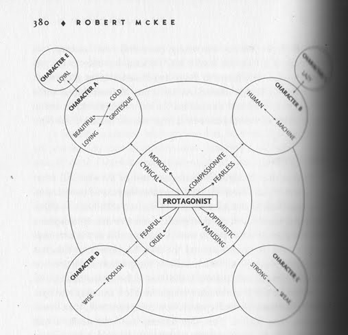
One of the best helps I've ever gotten is Robert McKee's book "Story," which is one of the Bibles of screenwriting, and a very good tool for writing fiction in general. What helped me a lot this time around was his setup of character depth and how characters affect one another.
First of all, character depth is not a handful of character attributes that might be oddly put together. And it's not a character being committed to one idea far over all others. A character becomes interesting when he or she has inner conflict of ideals. If a man claims to be brave, but in a crisis is cowardly, then you're onto something. If a woman is known by all others as being useless and uninteresting, but her closest friends see that she has an amazing talent that can easily take her to the top of the world, then you've got the beginnings of a story.
Going off of this, a well-constructed story has characters that bring out specific qualities in the protagonist. Around certain characters, a person is happy and attractive, but around one very important secondary character, they become depressed and repulsive. In this approach, a writer designs characters around the protagonist like a miniature solar system. It can be said that a minor character's job is to force the protagonist to reveal a contradictory quality about themselves.
For the story I'm working on, I have a character who originally created a business because it's his passion. But a national company's competition makes money scarce, and he meets a publicist. This publicist is all about marketing and building hype, and the character gets so caught up with the newfound fame ("finally, recognition for what I do!"), that he doesn't have time to do the work that he originally loved. That's the basis, and there's a lot of development that I've done with it, but I'm not sharing it because then you won't read the comic!!!!