Thursday, September 8, 2011

I'm Ready for my Closeup!


The face is typically one of the first things an artist learns how to draw. Not just in the formal training, but sometimes even in childhood. A face is the number one image that a viewer can connect with. This is so much so, that people often 'make order out of chaos', wherein we will attribute a facial likeness to something that is not a face: i.e. an electrical outlet can look like a very surprised person. The reason this occurs is because the face is the primary mode of showing emotion. Body language comes in second. Emotion is one of the most basic things that a person can understand and identify with. You don't have to teach a person to cry, smile, or concentrate. We just do it, and we can recognize it in someone else immediately.
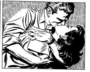
This is why an artist can take advantage of the close-up. A close-up is a camera angle where the primary subject is the character's face. It can range anywhere between including the character's shoulders and a significant area above the head, to showing one very large eye.
Using a close-up draws the reader in to a very intimate level with the character. Think of it this way: if you are actually this close to a person in real life, the
only reason you'd allowed to be that physically close to them is because you are intimately connected with them. When a person's face takes up most or all of your visual range, there is a lot of trust and vulnerability that they are allowing you to share. And if they aren't wanting that, they will retreat away from you.
Because the face is one of the first things an artist learns to draw, it is in some ways the easiest thing for them to draw. Thus, many times, an artist will cop out and pull the camera in close to the character simply because it is easier or it looks cool. Now, to be fair, a character's emotions aren't always cranked up to 11. A close-up doesn't need to be a very intimate thing, but like every other camera angle, there must be a purpose to it. For example, if someone is saying something important--even if they don't realize it's important--a close-up helps emphasize that importance. But just as pulling the camera back takes in the importance of the environment, bringing the camera close prepares the viewer for the importance of emotion.

Tuesday, July 19, 2011

Out of Your Element, Donnie!

A well-constructed character has some sort of talent, ability, or general quality that sets them apart from the crowd. Even the 'average joe' types need to have something about them that makes them more interesting than the other characters of the story, in order to make them worth the reader's time. Of course, I'm sure you could think of exceptions to this rule, but for the sake of time, just go with me on this one.
The character's quality that sets them apart offers the writer two equally valid options: putting that character 'in their element' and taking them 'out of their element.' I've been watching some Star Trek: The Next Generation recently, and the episode "New Grounds" displays both of these ideas very well. For those of you that have a life, let me fill you in on the character Lt. Worf. He's a Klingon, which is an alien race based on wolf pack, alpha male, warrior mentalities. He is very strong, and hell-bent on duty and honor, and how they relate to combat. Previously in the series, Worf's mate Keylarr dies and leaves Worf their son, Alexander. In this episode, Worf must deal with suddenly becoming a single parent.
Out of the element:
Worf is the ship's tactics and security officer. He's a Klingon. He's a bachelor. He is in no way cut out to raise a young boy. Thus, it becomes very interesting to watch him struggle to operate in this very unfamiliar territory. At first, Worf tries to use what is familiar. He instructs his son about honor, discipline, and Klingon heritage. Not only does it not work, but it pushes Alexander away. So Worf must learn something new and grow as a character to find out how to deal with this problem. He learns that in matters of the heart, a firm hand is not always the answer, and that Alexander is dealing with the death of Keylarr, too. Thus, they must work together to confront their feelings. That's not something that Klingons are very good at. But Klingons are good at fighting battles together, which is another way of looking at their mutual problem. Worf was out of his element. He tried to solve it first with what he knew, and that didn't work. He learned something new, and adapted it to himself, making the solution his own.
In the element:
In reference to a page where Supergirl blasts out her heat vision, Dennis O'Neil says "Supergirl shows her stuff, as every good superbeing should at some point in every story" in The DC Comics Guide to Writing Comics. Whatever the character's qualities or talents are, the audience needs to see them showcased. In the episode's final act, Alexander is caught under heavy debris in a fire. Worf may not know how to be an idealistic dad, but if there's an I-beam on top of somebody, Worf is the one guy on the entire ship that can do something about it. So, the audience gets to see what makes Worf such a unique character in comparison to everyone else. Usually, this is the most visually interesting part of any story, and it's typically in that final crisis. This is what the audience waits for and pays to see. What's really great about this episode is that this final action kills two birds with one stone. Earlier in the episode, Worf thinks he can't raise Alexander and wants to send him to Kronos, the Klingon home world. But Alexander secretly runs away. The episode's sub-plot is the cause of the fire. Worf is in crisis. He's the ship's tactics officer: his duty to the ship is to stay on the bridge and try to protect the crew, but he's also a father, and he can't stay on the bridge while his son is dying. In a moment of crisis, characters instinctively choose what is most important to them, whether they understand it or not. Even though he was getting ready to send Alexander away, he leaves the bridge to save his son. The danger is a type that Worf is qualified to handle, and it teaches him what's most important in his heart.
Having a character deal with something they are unfamiliar with can be just as interesting as watching them do what they're best at. If they do too much of either, though, it will become problematic and predictable.

Monday, May 30, 2011

It's Not a Bad Story, You're Just Not Emo Enough!

I've recently been playing through Final Fantasy VIII, which I thoroughly enjoyed when I was in high school. Now...not so much.
For those of you unfamiliar with the game, it's a long, long story, but for the purpose of this post, I'll just say that it's about angsty teens dealing with seemingly giant problems. My point is that back when I was 18, the game had a lot more pull for me. This has a lot to do with the fact that I myself was an angsty teen at the time.
This is about the general concept of target audiences. A target audience is any demographic that a form of entertainment is designed to appeal to. At first, one might think that an artist should try to make their work appeal to everyone, or at least as many people as possible. But this is impossible. I don't care how great your story is, but a 3 year old boy, a middle-aged housewife, a tween girl, and me, a twenty-something guy, cannot be interested in the same material. Peoples' brains are just too different.
But once those differences are distinguished, people become so similar within their sub-categories that it's downright creepy. Guys between the ages of 18-35 will watch anything with cleavage, explosions, and/or stupid humor. Tween girls will latch onto metro-style boy toys that can dance. Toddlers won't watch something unless it is simplified down to its most basic form, and appeals to their incredibly basic understanding of color, number, shape, morality, etc. The list goes on, and most entertainment companies have the human race figured out on a psychological and sociological level. Even if you think you have different tastes than these general categories, you simply fall into a sub-category with many other people. All humans seek entertainment, and that is something that somebody can make a profit off of.
How, then, can an artist use this to their advantage? First, the artist must ask themselves 'what is my target audience?' Probably the easiest one to aim at is the one you yourself fall into. If you like it, odds are, people similar to you will like it. But you have to determine what it is about your work that people would like. Look at other stories that have the same audience: what are their focuses? What do they downplay, or completely skip on? Different audiences have different attention spans: how do you need to adjust your work to compensate for this? If you're aiming at a target audience that you are not really a part of, that's fine, but do your homework. At the risk of betraying my own demographic, I have to admit that I really don't like zombie movies. But if I was commissioned to make a zombie comic, book, or film, my first step would be to find out which zombie movies/comics/books are the favorites and get a hold of those ASAP.
I'm almost done with Final Fantasy VIII. I can see some qualities in the story that still appeal to me, but I've outgrown it. But that's okay, because the world is never in short supply of angsty teens...no matter how much I may wish it.

Sunday, May 29, 2011

Space Travel Before It Was Cool


Some of my favorite science-fiction stories are about space travel. Now, there are obviously a lot of stories that fit into that sub-category, but my favorite ones are about space travel before mankind could actually do it. Think about it: now that humans actually can live and work in space, or on the moon, how might that have influenced the fiction writers and illustrators of today, as opposed to before the concept really began to take form in the 1960s?
Science-fiction movies and TV shows of the time before the NASA program had a much more simplified concept of space suits, rocket ships, aliens, and technology. Novels and comic books showed space travelers as pretty basic explorers, wearing jumpsuits with domes attached to the head and a small breathing apparatus. Planets very distant from a sun would simply be cold, as opposed to housing liquid methane, and planets close to the sun might be kind of hot, rather than instantly-boil-your-face-off hot.
I've always viewed these kinds of stories as a bit more 'pure' in their imagination. Though the NASA program--and others like it--have become a spring-board for a great number of fantastic ideas, science fiction stories preceding space travel had a tendency to focus more on the 'fiction' as opposed to the 'science.' A lot of this quality has been lost because audiences today simply can't stretch their disbelief as much as they used to: for many decades, space suits must be depicted as bulky, multi-layered, vacuum sealed costumes, in order to keep out the harmful environments that all people know exist in space.
In this sketch, I tried to imagine a space suit of someone walking around on Saturn's moon Titan--a moon extremely distant from the sun. One of my goals was to imagine the suit as if it would have been imagined in the 1950s. The man is wearing a flight suit, with a few attachments for the airless, freezing, icy environment.


Monday, May 16, 2011

Silhouettes: Part 2, You will Know Us by our Shadows

This second aspect of the silhouette is in regards to character design. If I did my job correctly, you should instantly recognize these three people. The reason that you can is because there are characteristics about their structure and design that separate them from practically all other people you've ever seen. When I put it like that, it sounds impressive, right?
A character should be designed with this issue in mind. Overall shape and silhouette are important for the characters body, but it's doubly important for their head. This is because when the camera pulls in closely to the character (like when they are talking or expressing) they still remain instantly recognizable on some level--at the very least, distinguishable from the other characters. Thus, hairstyles and head gear become great assets to an artist.
But if the characters aren't going to be completely shadowed 100% of the time, why is this important? Excellent question, I'm glad you asked. Like I said earlier in this blog, the mind recognizes people by abstraction and generalization. What if the entire Looney Tunes cast was all rabbits? Do you think Bugs would stand out as much as he does from the rest of the cast? (remember, there are always exceptions to 'rules' in art: in the cartoon show "Tiny Toon Adventures" there were the two lead characters Buster Bunny and Babs Bunny. Two lead characters with nearly identical silhouettes. The writers knew that Buster needed a female counterpart/love interest, and that could only be accomplished with another rabbit, and Bugs Bunny--from the show's parent program--already established what rabbits looked like in this show. Thus, some tweaks were made to make Babs visually different on some level, but their contrast is largely in their personalities)
Characters with silhouettes instantly recognizable on a national or global scale are few and far between. And not every popular character has a perfect silhouette. What's most important is that the character is unique in their own cast.

Monday, April 18, 2011

Silhouettes: Part 1, For every Action, there's a Jackson


This image is taken from the book "Cartoon Animation" by Preston Blair. Here, he demonstrates the importance of the silhouette as it relates to action. The version on the right is still understood as a duck pulling the rabbit out of a hat, but the version on the left reads better because the shapes suspended in space on a basic level communicate the same thing.
Here's another way of looking at it: I recently saw this image from the play "The Butler Didn't," currently being shown at the Metropolis Performing Arts Center in Chicago. You might remember a statement I made a while back in this blog: nothing is more visually interesting than a beautiful woman. While I still hold to this idea, the actors compensated for this. Both women are in the foreground and are dressed very nicely.
So, why is your attention first brought to the young man in the dull grey suit behind them? Well, for one, he's in mid-air. It also helps that he's in the center of the composition. But there's still two beautiful women--one wearing a short, bright red dress--that are closer to the viewer, and therefore much larger compositionally. Let's look at this through the magic of silhouette-vision (i.e. 20 minutes of work in Photoshop).
Notice how subtle the two women's poses are. The one on the right is holding a wine bottle in front of her, which protrudes it from her silhouette, drawing attention to it, but no one in this composition is crazier than the guy in mid air. His arms and legs are protruding in all different directions. The larger man in the way back has no way of drawing attention to himself other than the fact that he is wearing the brightest color on the stage. If he wanted to draw attention to himself, the best thing he could do would be to take whatever it is he's holding onto and hold it above his head. That would reveal it from his silhouette and spread out his body more.
Creating a unique silhouette is essential in communicating an idea. In the case of action, the storyteller's job is to convince the audience that an action is occurring. Though subtlety is just as important as extremes, it should be quite obvious that the more extreme a pose is, the more clear it is what is happening. With all of this in mind, look at every one of Captain America's poses from these two pages by Jack Kirby. There are probably about a thousand reasons why Kirby's work is great, but these two pages are especially good at demonstrating how a good, unique silhouette does wonders for an action sequence.
Shameless plug: that's my brother, Michael Woods, doing the crazy jump. He's an actor in Chicago; if you're ever in the area, go see a play.


Friday, April 15, 2011

The Two-Shot

The two-shot is any type of camera angle which hold two characters in it. With this broad definition, it's used a lot in film and comics. Fortunately, there's lots of ways to do it, all of which are explained in the book "The 5 C's of Cinematography."
For this example, I drew a normally risky two-shot, where each character is evenly placed in the panel, for the most part in a profile shot. The reason it's a risky camera angle is because when a person is perfectly profile, or facing directly, to the camera, the image is flattened and less interesting, i.e: more depth makes an image 'pop out.' There's also no background to the image, which doesn't help, but in the final version, there will be a word-balloon from the character on the right, placed in the top-center. The reason I went ahead with this angle, though, is because placing two characters profile to the camera maximizes the distance between them, which in this part of the story is important. If I wanted them to be compositionally closer together, then I might have put the camera closer to one of them as opposed to the other.
To make the shot more interesting, I looked at "The 5 C's of Cinematography" and what it had to say about two-shots. In most two-shots, you'll have one character dominating the image over another. This is done with lighting (being well-lit or shadowed), position (being higher or lower than the other character) or by "playing to the camera," (facing more toward the camera, or away from it). Since I wanted them to be eye-to-eye with each other, I couldn't make one higher than the other. The light is coming from the left of the panel, lighting the character on the right and putting the other in shadow. The character on the right is turned a little toward the camera, and the other is turned away. Lastly, the speaker is gesturing toward the other character. This not only creates an interesting shape of his silhouette, but also draws attention to the speaker.

Thursday, April 7, 2011

Character Design Basics


This is the cast of "Seinfeld."...now what's weirder, the fact that I just reduced the four main characters of a TV show down to basic shapes, or the fact that even if you've only seen commercials for the show, you know which character is which shape? This is not a coincidence. While I don't know this for a fact, it's very credible that the creators and casting directors put a lot of thought into the basic shape of the cast members.
This was all pointed out to me a few years ago in art school. The basics of character design rely on the human necessity to find visual distinction between people. At the most basic level, you have distinctions of race, gender, age, and physical disposition. I have been thinking about this recently because my roommate and I have been watching the show "Community." The cast of characters in it has a lot of visual variety in these basic levels.
Quick note before I go on: this has NOTHING to do with racist or sexist motives. It is an inherent quality in the human psyche to distinct people by gender and race, as well as age and physical disposition. On a subconscious level, when the mind is trying to recall a person, these factors simply come up first.
In "Community" the two people that share the closest resemblances on these levels are the two young girls Britta (foreground) and Annie (middle row). They're both young, white, physically fit girls. But Britta is a blonde, and Annie is a brunette: one of the primary distinctions that guys make when comparing girls. Variety is obviously not on just the basic levels, but extends into clothing style, hair, height, and all the other factors that make no two people exactly alike.
Variety is necessary in character design because an audience has to instantly 1) connect faces with names with personalities and 2) find someone in the cast that they can relate to. Variety can be something that is a part of the story, too. The original Star Wars trilogy emphasized the variety of species and character background in the Rebellion with the uniformity of the Empire. Some stories have an agenda of political correctness, which is fine, but good luck sneaking it past the audience without them catching on very early.
Sometimes, though, variety in character design isn't completely possible. With as much variety of characters in "Lord of the Rings," when I saw the first movie for the first time (having not read the books) I was so blown away by everything the film was showing me, that I sometimes got Aragorn and Boromir confused. Viggo Mortensen and Sean Bean were both perfectly cast, and looked exactly as Tolkien described their characters, and their similarities are a part of the story, but I just needed to see the film again to understand how different they both were. In other cases, factors like location and time period don't allow for visual variety. There's no two ways about it: a World War II story about US soldiers is going to have a bunch of white, physically fit, guys who are all basically the same age, and wearing the exact same clothing. The TV series "Band of Brothers" had this tremendous hurdle to deal with on a large level, and so lots of focus was put into the distinctions of personality between characters.


Wednesday, April 6, 2011

It's *cough cough* Abstract Art

From Here to Eternity? Gone with the Wind? Casablanca? Pretty Woman? None of the above.
Leonard Starr's "Mary Perkins: On Stage" is a soap opera newspaper comic strip from the sixties. Starr's work is incredibly detailed and rendered very realistically. He put tons of effort into not only making his characters unique, but his backgrounds as well. So, a panel like this is rather unusual for him, with the background completely obliterated by radiating lines. So why would he abstract a background?
Abstracting a background is one of the things that comics can do that is rather unique to the art form. Film can drop focus on the background, but anything more than that and it's a little alien to the medium. Comics have the luxury of letting the artist establish an environment, and then, when necessary, abstracting it--or holistically dropping it--for the sake of drawing focus on the characters. There are actually several reasons to do this, and several ways. The reason I'm focussing on is when a scene's emotion needs to be the central focus. Notice how the lines are radiating from the couple, as if their kiss has so much energy it's affecting the world around them. In this other example, a panel from Archie Goodwin and Al Williamson's "Secret Agent Corrigan," Adrienne's shock at what Burke just said is emphasized by the jagged and disrupted brush strokes around her. In my example, the woman's sadness is emphasized by the darkened background.


Monday, March 28, 2011

Mother Knows Best


I recently watched the film "Saboteur," and it had one of Hitchcock's favorite archetype characters: the dominating mother. Probably my favorite example of it is actually in the film "Notorious."
The dominating mother is not frequently used in stories, but it has incredibly powerful irony. First off, the mother image is usually one of love and life. A good mother is selfless in her care for her children, whom she literally gave life to. There are many cultures and mythologies which have some religious significance attached to the mother figure--often times connected with the creation of the world and/or the human race. This, combined with social etiquette, often gives mothers a sense of reverence and respect ("you don't talk that way to your mother!"). Mothers are often paired with images of life, plenty, and abundance because they are birth-givers. A good mother wants what is best for her children, but allows her children the freedom to choose their own path.
But these dominating mothers twist every aspect of these classical characteristics. These characters are entirely selfish, and grant false love and care only when they benefit from it. They gave life to their children--or high standing to their underlings--but her children are forever indebted to her for granting them this 'favor.' She is above everything, and rules over everyone with an iron scepter. She has wealth and abundance, but it is not because she gave birth, rather, she took the things she has. One of her greatest abilities is her knack for manipulation; she will twist her underlings into doing what she wants, because they think they want it too.
My favorite part about this character, is another level of irony. She remains in power mainly because she commands respect and obedience, which would be due to her if she were a good mother. Because of her position, she guilts her children into treating her like a birth-giving, selfless, loving mother. Everyone beneath her knows she's manipulative and selfish, but they won't dare question her because since she 'gave' them life or high standing, she can take it away. Though this mother is so obviously twisted, people treat her with love solely on the basis of the fact that she is technically a mother.
It's a shame that films, comics, tv, etc. don't use this interesting character type more often. In stories where it might be possible, for one reason or another, the character is much more commonly the mafia godfather character. You can always tell a lot about a person by how they treat their mother (guys especially). This is because when a person is around their mother, they are more prone to reverting back to their childlike/childish ways: ergo, their more natural state. Fathers have this same power, but it's much more obvious with mothers, probably rooting back to their birth-giving nature. Even good mothers have an incredible power over their children: no person of any standing doesn't cringe a little when their mother shouts at them, using their full name.


Wednesday, March 23, 2011

They're Not Moving, You Just Think They Are

I've recently picked up a commission to draw a dancing couple. I'm happy for this, mainly because I really love drawing dancers. Any type of extreme movement gives the body a lot of energy, but the illustrator is at a disadvantage because illustrations are static. Movement can--at best--be suggested.
Movement is a funny thing, because if you look at a still image of a person in the middle of just about any movement, but especially extreme ones, they look really, REALLY, weird. Reasons could be because weight is shifting, the basic body parts haven't arrived at their destination, or it just looks unnatural. The artist has to choose a part of that movement that not only tells the audience what the movement is, but also looks dynamic and interesting.
In these dancing sketches, I started developing a pose that is more towards the end of the motion: the guy is pretty much finished moving and is striking a pose, and the girl is pretty close to being done. The energy is high for both of them, but they are done moving. To create some more energy, and a more immediate sense of motion, I started playing around with the clothes they're wearing. Dancers commonly wear flowing clothes for this very reason.

Monday, March 21, 2011

Baby's got Back

You ever notice Iron Man's back? In the movies, the design of his armor gives his lower spine this vaguely inhuman curvature which is really slick. I couldn't find the perfect picture of this, but if you've seen the Iron Man movies a few times, you probably know what I'm talking about. Emphasizing this muscle development is not exactly common, mostly because characters are usually turned toward the viewer. It's also not common with male characters, because emphasizing an s-curve shape is much more typical with female characters (I'll probably get into that in another post). I think the reason it's done, though, is because 1) superhero type male characters are typically barrel-chested, and these muscles (the Latissimus Dorsi, according to my anatomy chart) are very important for that and 2) it gives the character a nice butt, which--let's be honest--makes viewers look.
My drawing was of the popular Green Lantern character Hal Jordan. He's turning to the side, but while I was drawing the picture, I thought of this.


Saturday, March 5, 2011

Just CHEW the Scenery!

One of the traits that cartoons are known for is the exaggerated expressions. Daffy here is running in terror, obviously. Now, aside from the fact that ducks don't really run, or have hands, the main anatomical feature that is exaggerated is his mouth. No mouth--human or duck--can stretch that much. But that's one of the great things about cartoons: you can stretch and bend anatomy to heighten emotion.
This might seem restricted to the abstracted world of Looney Tunes or Disney. But the same principles can be applied to much more realistic styles of drawing. Though not to the extent of cartoon characters, realistic anatomy can be stretched or squashed to a minimal degree to communicate an idea. I've been applying this in my drawings recently, specifically with some Street Fighter sketch cards I've been working on. Here, Blanka's and Balrog's mouths are both open a little wider than the actual human mouth can stretch, and I pulled the lips at the corners a little further (theoretically adding muscles to the facial anatomy; I personally have some pretty flexible lips, and even I can't pull my mouth exactly like this). If you don't believe me, take a look at the reference photos I was using. Under close examination, you'll see what I'm talking about.
The purpose of this was to show some real rage in both characters. Bearing teeth is a worldwide human gesture to show anger: the more teeth you show, the angrier you can look.


Sunday, January 16, 2011

The Best Offense is a Good...Weight Distribution

I had just drawn a pin-up of Green Lantern, and wanted to do another. So I went back to a sketchbook page with lots of different pose ideas roughed out and saw this one. I sketched it out at 6"x9", and scanned it in. Once I started pencilling it out on its full size, I started to feel like the image didn't have enough energy or power to it.
My first thought was that it was a matter of line work, and that it might be solved as I draw it out. But just in case, I set up my camera and struck the pose with some energy behind it (quick movements and flexing muscles--how the character would theoretically be moving).
At first, the result frustrated me. When taking the picture, I put my weight on the wrong foot and the pose was completely inaccurate. Then I realized that my photo was better than my drawing.
The original pose is actually not a bad or incorrect pose. The problem was with the fact that I was trying to communicate energy and power, and that pose wasn't doing it. It's because the weight was distributed on the back leg, rather than the front one. The layman might not think that an important issue, but ask any dancer, athlete, or fighter, and they will tell you that distributing weight on one foot versus the other changes a lot. One of the main things that weight distribution effects is direction. You can't move in any direction without putting your weight towards that direction. In this case, Green Lantern is blasting an energy bolt out of his power ring. I want him to look like he's making a powerful attack. With his weight pushed back, he looks like he's defending or retreating, whereas with it pushed forward, he's really moving forward. This pose is essentially a punch. An energy blast from the hand will have more power behind it if the body is a part of that blast.


Saturday, January 15, 2011

You Have to Admit: It Sells.


Trends come and go. In my very few years of life, even I have seen people's 15 minutes of fame rise and fall. For anyone getting into any form of entertainment, this idea must be evident in their minds. What is popular today will change in a week, a month, a year.
That being said, anyone getting into any form of entertainment should pay serious attention to the trends of their time. Regardless of whether they themselves like those trends or not, they have to admit that popular things sell better than unpopular things.
Take for example, comic book creator Jim Lee. He is easily the most popular superhero comic artist of the day. He isn't producing anything now that I know of, but many popular artists that are producing mimic his style in various ways. When he does a comic--or even just a cover--that comic WILL sell.
Lately, I've taken this fact into account. I would never say that Lee is my favorite artist or that he's a comics master, but I have to admit that his art looks really cool. After paying close attention to what he does, I've decided that it's in his rendering (adding of details through shadow, line, or texture) that he interests fans. I have a--loosely--similar drawing style to him, so I've begun to make attempts at mimicking some of his methods. This example is part of a Green Lantern pin-up that I pencilled.
Disclaimers:
1) Just because it's popular doesn't mean it's good.
2) Just because it's popular doesn't mean it will fit with your particular style.
3) Copying someone else's art isn't okay. If that artist is popular, people will totally see that your copying.


Thursday, January 13, 2011

I'm on a BOAT!

Backgrounds are often treated as just that: backgrounds. Simply the background against which the story is taking place. Oftentimes, comic creators are tempted to go with very average locales: an office building, a house, a park, etc. Sometimes, the story calls for it, and it works for the way the plot progresses.
But I think that a lot of potential is missed here. One unique quality in many comics outside the US is the attention to environments. Many times, the camera is pulled out a bit more to reveal where the characters are, and the locales are far more unique and interesting. This is often the result of treating environments as characters themselves. I used to think that paying too much attention to backgrounds would distract the reader from the characters, but then I read Osamu Tezuka's "Buddha," and then I changed my mind.
My drawing here is an unfinished panel (what's left is mostly just shading in various areas). It's the first panel of the scene, and I used the down-shot not to create isolation but to display where exactly the characters were. Since I lived most of my life land-locked, I didn't know anything about boats. So the research was enormous, because I knew I needed some very specific details about this scene. Not only did I look at pictures of docks and boats, but also the way other artists did similar scenes (Leonard Starr and Al Williamson, particularly).

Friday, January 7, 2011

Gridlock!

First off, there is a difference between copying another artist's work, and doing a 'study' of it. When someone copies an artist's original work, they are doing just that: copying. Sometimes this is done illegally and without the original artist's knowledge/approval. The copier might even advertise it as their own original work. This does happen a lot, and it's a shame, because I wish people could be responsible. Doing a study of another artist's work is a very good practice for an artist to do. When drawing, painting, sculpting, etc., the artist is looking very closely at every square centimeter of the piece. A good artist knows their own work incredibly intimately. Because of this inherent close attention to the smallest details, it is good for an artist to try and recreate another artist's piece. It'd be one thing to simply look at the piece, but recreating it brings that intimate knowledge too. This is very helpful, because if the original artist is one that inspires the new one, there is no measure to what an artist can learn by doing a study.
One method of doing a study is by setting up a simple grid over the original piece. For my example, I was drawing a bookmark for someone, which was a recreating of "Saint John the Baptist" by Caravaggio. I put up the grid in photoshop, and drew one of the same size on my paper. Instead of looking at the picture as one whole image, I looked at each square as an image in and of itself. This helps the artist because it taps into the abstract/creative centers of the brain (which we generally want to use), instead of using the more rationally-based centers of the brain, which would perceive this image simply as a young man. Looking at each square individually also helps make the study more exact. It's simply easier to figure out the exact placement of the shoulder when the image is 1"x1" instead of 2"x7".