Wednesday, August 25, 2010

Man in Motion


I came across this Dennis the Menace strip today, and was happy to find that it was very similar to a sketch I did just the other night. Though usually suited for the process of animation, it's important for any artist to have a solid understanding of how a motion is executed, step by step. In my case, I was trying to draw the final dip in a waltz, but I couldn't figure out how exactly the dancers got into that position. So, I backed up the video and drew them as they got there. Preston Blair, in his book Cartoon Animation, goes into great detail about the stages in lots of different motions (walking, running, sneaking, jumping, etc.).
For comics, a study like this can give characters' movements much more credibility, even if they are just static images. As I've said before, there is a strong difference between someone posing as if they are running, and a still image of someone running.

Tuesday, August 24, 2010

The Ways We Sit

There are a surprising number of things that go into how a person sits down. I'm not talking about the muscle movement--that's a whole other post. What I'm talking about is the fact that hardly anyone sits with their back straight, eyes forward, hands folded in their lap, feet facing forward, with a pleasant expression on their face. I say "hardly" because I just drew someone who did exactly that, which brought this detail to my attention.
If a person is relaxed, they will sit differently than a person who is laughing. When a person is listening, their head might be forward a little. Lots of people talk with their hands, so if they are explaining something, that could have an effect. Lots of people slouch or shove their shoulders forward. Guys cross their legs one way, and girls cross them another. I've even heard that people will sometimes cross their legs towards the person they are attracted to, but I'm not sure how true that is. The point is this: all the different attitudes, personalities, emotions, physical dispositions, and tones of a scene determine how a person sits. I raided my photo reference library for a few examples of this: natural and posed.


Thursday, August 19, 2010

Gestures


"An imaginary line extending through the main action of the figure is the 'line of action.' Plan your figure and its details to accentuate this line. By doing so, you will strengthen the dramatic effect. The first thing to draw when constructing a figure is the line of action."--Preston Blair Cartoon Animation
What Blair means by this is that a figure in action should be reduced to one or two lines, and those lines determine everything about that figure. The reason behind this is that an artist can do very broad, sweeping lines in this first step, and the energy in those quick lines can stay in a drawing as it develops.
Right now, I'm working on a comic that has a lot of people swing dancing in it. This sketchbook page was from watching a few videos online. When drawing these, I also kept in mind the things I talked about in the very first post. I highlighted where the lines of action were in these sketches. At this point in the drawings, I'm not concerned with anatomy, costume, expression, or anything else other than the energy in the poses. Swing dancing is full of energy, and if I want to capture that onto a static image, it needs to begin with that as the central focus.

Monday, August 16, 2010

Lettering


Will Eisner is one of the greatest comic artists of all time. There, I said it. Now that that's out of the way, I can explain one of (out of a great plethora) the reasons why I hold to this. Eisner had a record for making the title of his books a part of the image (as opposed to imposing the words right on top of a separate image, as is customary). Having backgrounds and characters interact with the title of the book is not necessarily restricted to comics, but it is something that I've seen more in comics than film (some film examples might be the opening credit sequences in North by Northwest, The Great Muppet Caper, and Panic Room).
Some comics have even gone so far as to have the characters be so self aware that they acknowledge the existence of their captions and word balloons. The juxtaposition of word and image is so familiar to comics that something like what Eisner does can be used on a more regular basis, I think.

Saturday, August 7, 2010

Leading Men


I recently found out that Lyle Wagonner was passed over for the role of Batman when network execs decided to go with Adam West. At first, this seems like splitting hairs as far as acting ability goes, but closely examining their faces, you might note that Adam West falls into the "Classic Leading Man" mold a little bit better.
In character design, it's not just about whether the person is good looking or not (how I wish Hollywood understood that). For the story, a person's personality has to fit their appearance. The best way to explain this is with an example: say a guy is raggety, unshaved, has an eyepatch, missing teeth, and a tattoo on his arm. Would you believe me if I told you he has an unparalleled passion for truth, freedom, and justice? But you'd probably believe me if I told you he just robbed a bank. Strong jaw, full face, a nice head of hair, deep sexy voice, and a warm but not too big smile. These are some of the most instantly recognizable traits in the classical leading man archetype. This is not to exclude every man outside of Robert Redford as a hero, though. All I'm saying is that if your story has the archetypal hero, your audience is more likely to buy into it if the guy looks the part. There are plenty of other hero-types out there, but this is the guy that will ride in on a white horse, slay the dragon and save the princess.
And Lyle Wagonner went onto a role more suited for him: getting Wonder Woman on a weekly basis in the 1975 series when he played Col. Steve Trevor.

Tuesday, August 3, 2010

Face the Facts


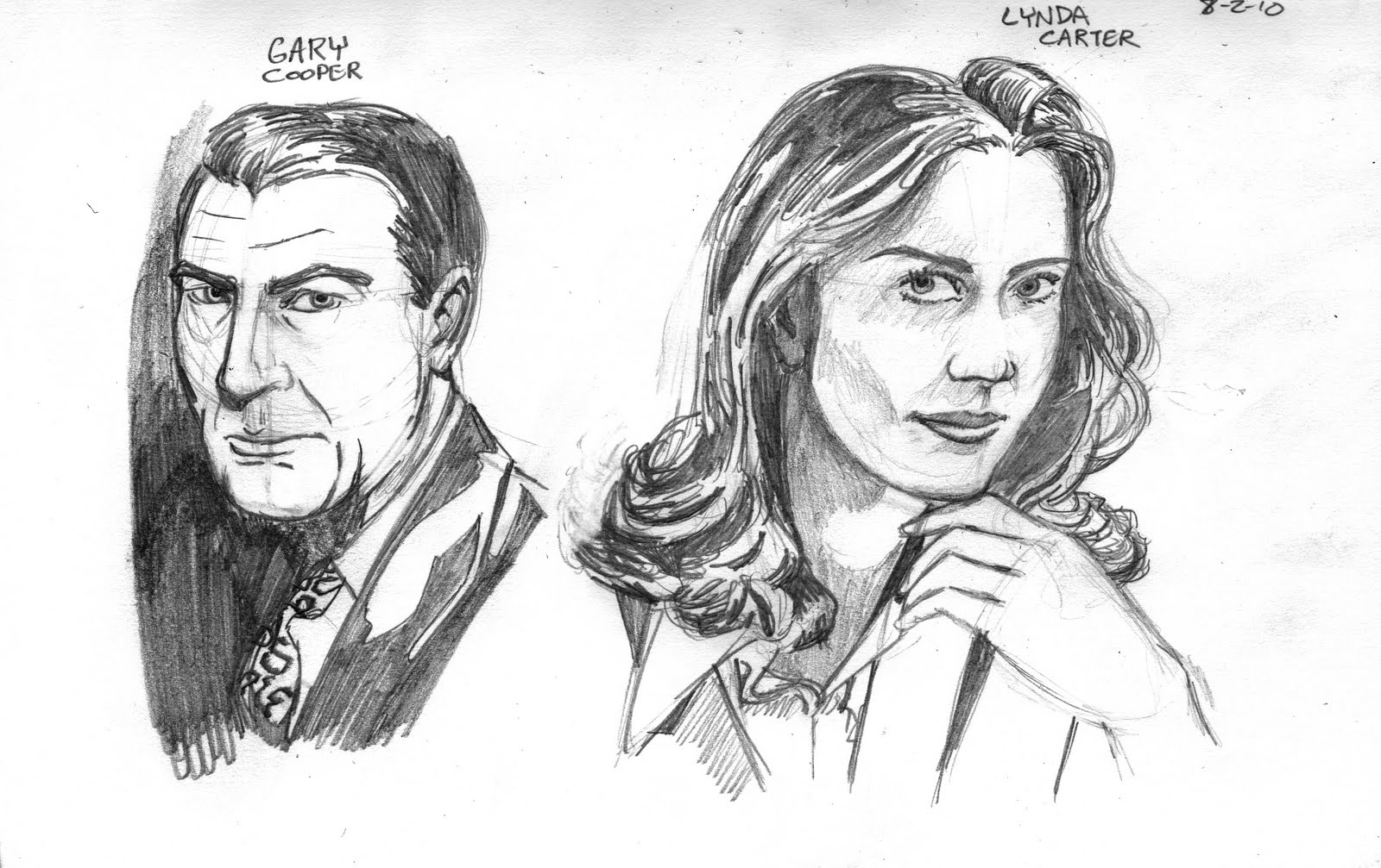
Every now and then, I get on an Andrew Loomis kick. In my opinion, Loomis is one of--if not the--greatest figure artists of all time. He's certainly the best artist to learn from, because he literally wrote the book(s) on drawing people. Anyway, this time, I was looking at some diagrams he made of the human face, and tried to mimic it in drawing from photos. Fair warning to the person that draws from a photo: modern photos of celebrities and models are often digitally adjusted. You also have to remember that plastic surgery and makeup are miracle-workers these days. A good digital artist, makeup artist, or doctor won't manipulate a person's face making them look too different from what they actually are, or create physical impossibilities, but just be on the lookout. If you're doing a serious illustration, I definitely recommend the use of video and candid shots of people, as opposed to ads or glamour shots. For these sketches, I didn't really care too much, so the pictures I got were idealized in various ways.
The drawing of Gary Cooper was the easiest. Drawing men--especially as they get older--is much more forgiving for me, because I feel like if the lines aren't perfect, it's okay. Lines on a face denote age, so you can get away with a little more.
Lynda Carter took about 3-4 times longer to draw; I even had to use a lightbox to help with her lips a little. And I'm still not 100% happy with how it turned out, because I don't think it really looks like her. Drawing women for me is always difficult, because it's just the opposite of...um...men. Efficiency of line is of the utmost importance. One stray line, and it changes the image or makes them look old.
I learned recently that humans recognize faces by abstraction, as opposed to creating an exact image in our imagination. I think I got this with the Gary Cooper image. It doesn't look exactly like him, but I caught his long nose, square chin, and wide mouth. Loomis' diagram helps to place everything properly on the face. There are diagrams for the human face that chart every contour of it, and some of it is pretty wild how basically similar we all are.